Your figures in one clear dashboard.
- ✓Data sources connected: Analytics, CRM, ads and shop together
- ✓Live dashboards built to fit in Looker Studio or Power BI
- ✓Automated reporting, no more exporting by hand
What is automated data reporting?
Automated data reporting means your data sources are connected, your figures come together in live dashboards and you steer on real, current numbers instead of gut feeling. Separate exports and spreadsheets are what actually cost time: you cut and paste data from five systems, and by the time the report is finished it is already out of date. We connect your sources and build the dashboard that brings your figures to life, so you can steer on them.
For those who steer on figures,
not on feeling.

Directors & management
One dashboard with the figures you steer on, always current. No waiting for a monthly report that is out of date by the time it lands.
More →
Marketing & sales
Traffic, leads and ad spend from Google Analytics, your CRM and advertising platforms in one place. See at a glance what works and what costs money.
More →
E-commerce & operations
Revenue, stock and margin from your shop and bookkeeping in a single overview. Spot trends and bottlenecks before they decide your week.
More →From scattered data
to one clear picture.
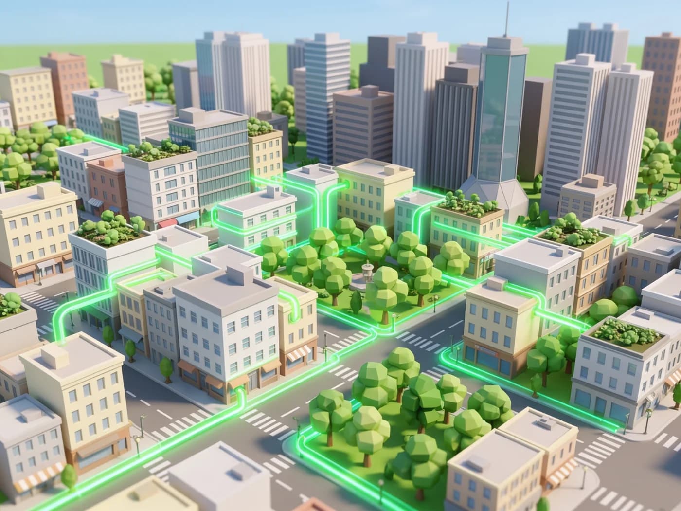
Connecting data sources
We link your data sources together: Google Analytics, your CRM, advertising platforms, your shop and your bookkeeping. The data arrives automatically, so you never have to stitch separate exports together again.
Every source, one placeDashboards built to fit
We design clear dashboards that show exactly your KPIs, not every metric available. Built in Looker Studio or Power BI, so you read your figures the way you read a traffic light.
Looker Studio or Power BI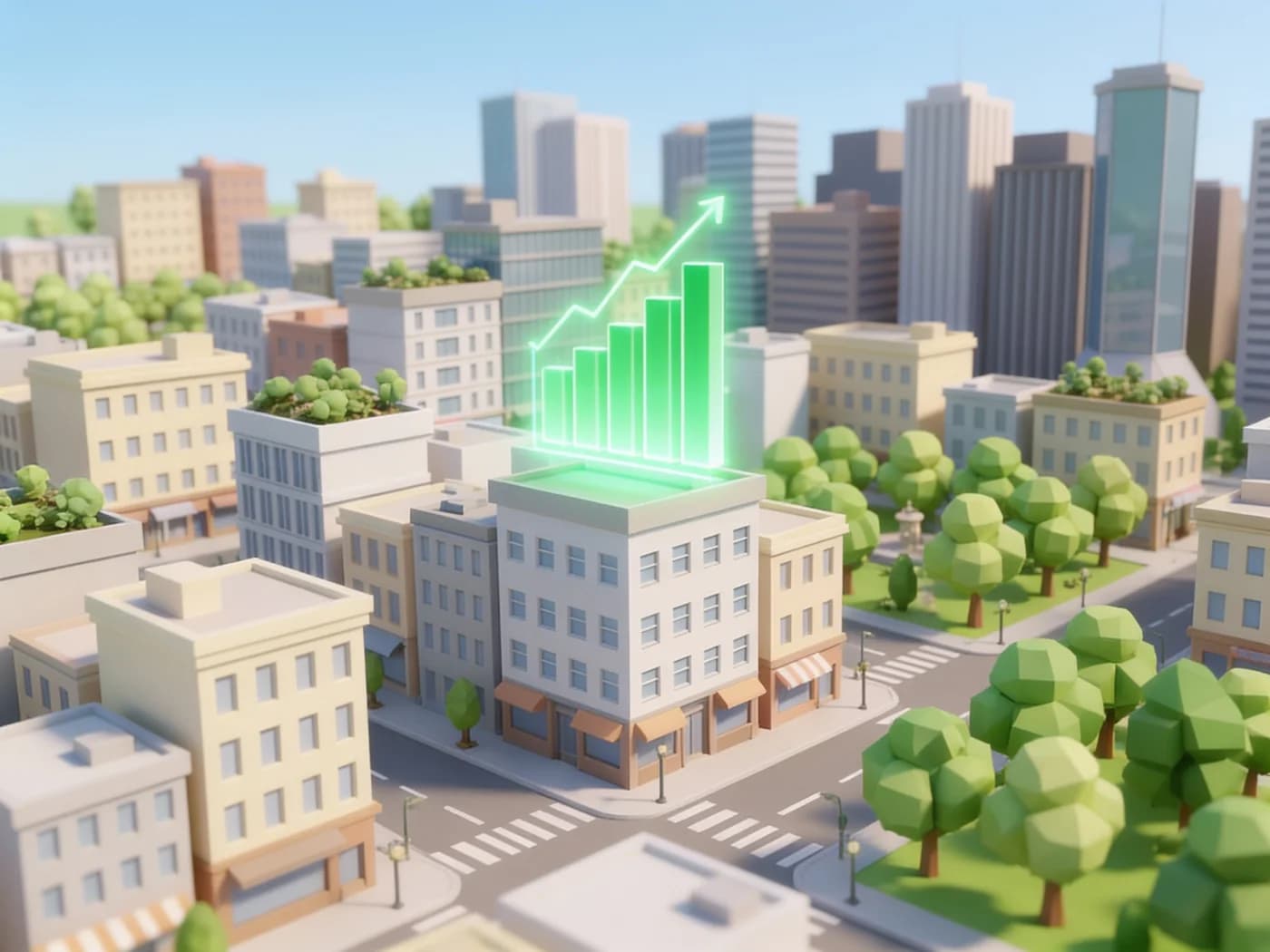
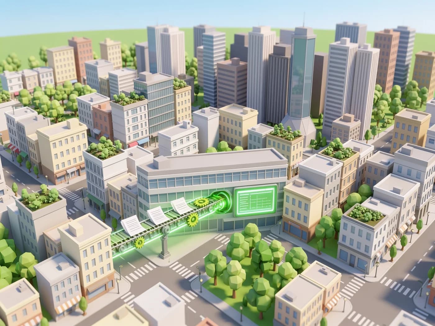
Automated reporting
The data refreshes itself and the report lands in your inbox on your own rhythm. Set alerts on the figures that matter, so you see a deviation the moment it happens instead of a month later.
Fresh figures, no effortFrom data chaos to dashboard.
Data inventory
We map which data you collect, where it lives and which questions you want it to answer.
Dashboard design
We design dashboards that show the right KPIs for your goals, clear and readable at a glance.
Connect & automate
We link your data sources and automate the collection and processing, so the figures update themselves.
Training & tuning
We train your team and refine the dashboards based on real use, so the report grows with your questions.

Curious what your
dashboard would look like?
In a free call we sketch out the dashboard that suits you.
Connected to the tools
you already use.

A good dashboard hands you back the wheel: you see what is happening, at the moment it happens.
Erik puts it like this:
“A dashboard is only good when you can make a decision with it and need no explanation.”
Read more about AI
Frequently asked questions
about data & reporting
Click a question for the answer.
Read on.
Ready to steer on your figures?
Book a no obligation call. Tell us your sources and your questions, we will design the dashboard that answers them.